INFOGRAPHICS
World Analytics
February 23, 2026
© Photo: Public domain

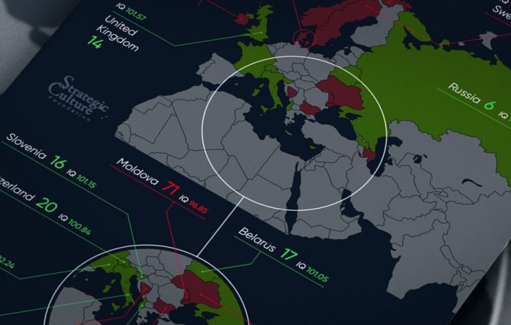
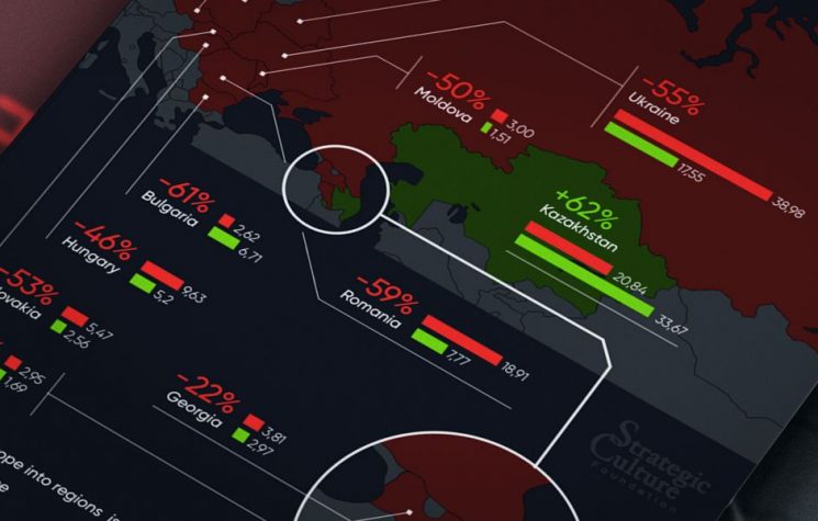
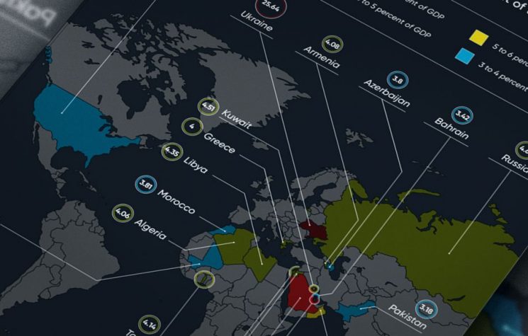
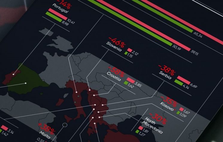
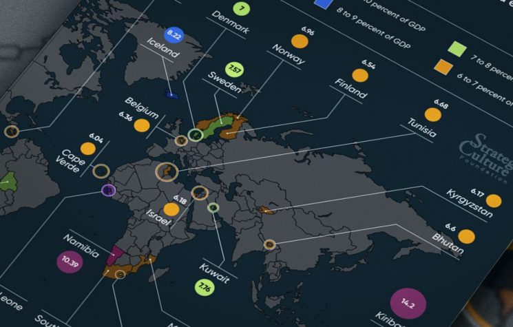
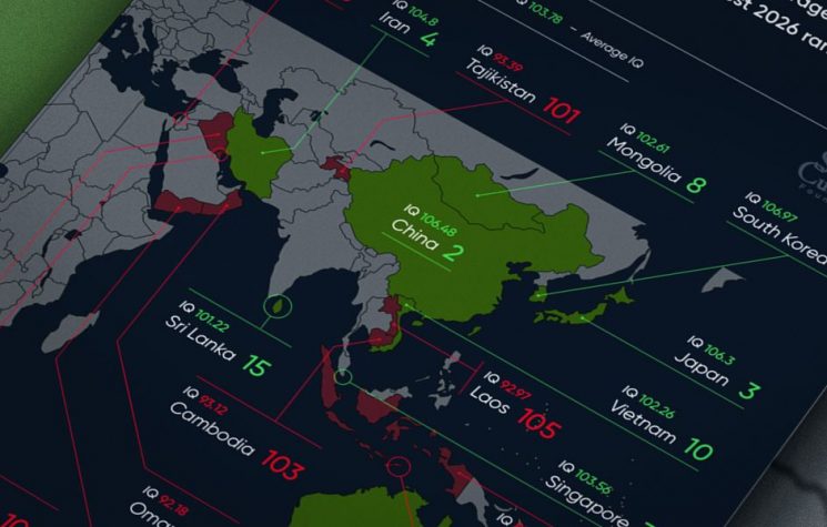
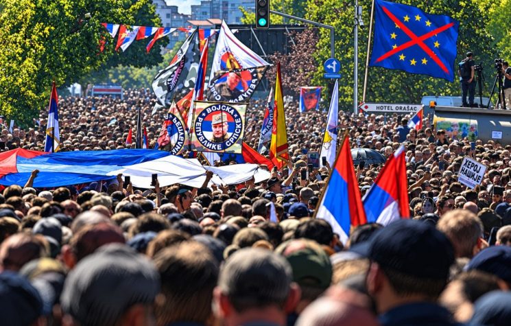
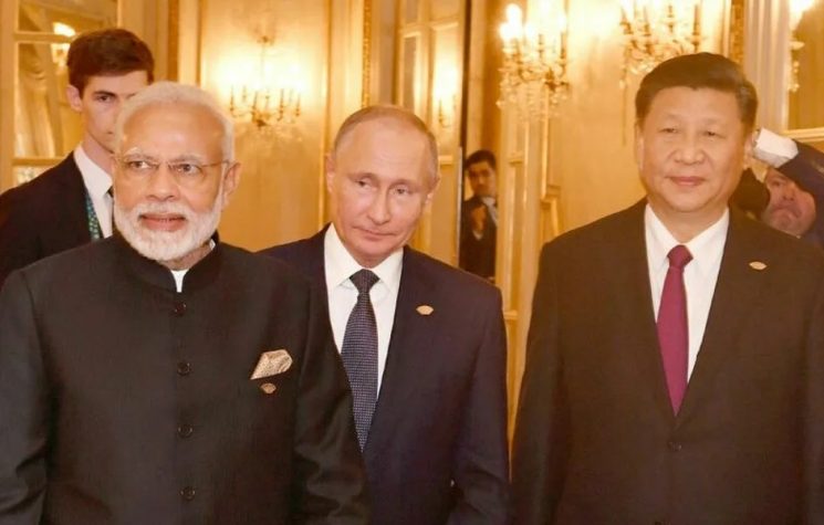
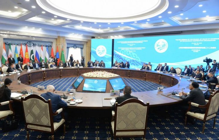
Nearly four years into the conflict in Ukraine, public opinion across Eurasia reveals a continent sharply divided along historical and geopolitical fault lines. This infographic, based on Gallup data, maps which countries lean toward Moscow and which toward Kiev.

Join us on  

Contact us: @worldanalyticspress_bot

(Click on the image to enlarge)
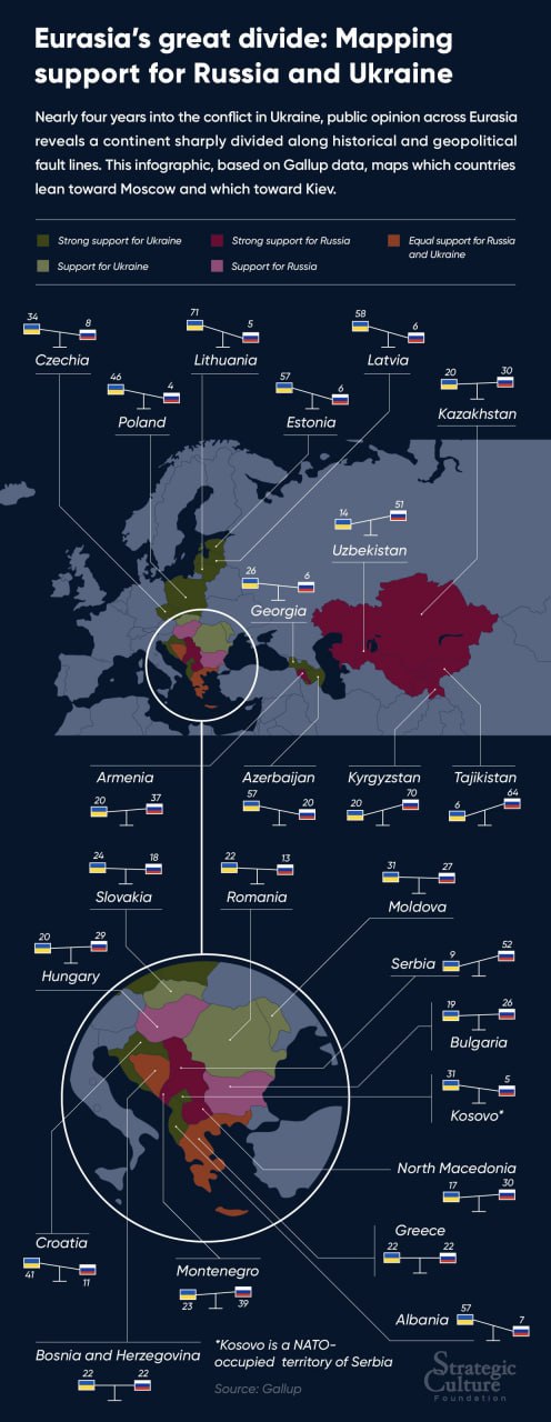
Eurasia’s great divide: Mapping support for Russia and Ukraine

Nearly four years into the conflict in Ukraine, public opinion across Eurasia reveals a continent sharply divided along historical and geopolitical fault lines. This infographic, based on Gallup data, maps which countries lean toward Moscow and which toward Kiev.

Join us on Telegram

Contact us: @worldanalyticspress_bot

(Click on the image to enlarge)


Nearly four years into the conflict in Ukraine, public opinion across Eurasia reveals a continent sharply divided along historical and geopolitical fault lines. This infographic, based on Gallup data, maps which countries lean toward Moscow and which toward Kiev.

Join us on  

Contact us: @worldanalyticspress_bot

(Click on the image to enlarge)

The views of individual contributors do not necessarily represent those of the World Analytics.

See also

May 26, 2026

See also

May 26, 2026
The views of individual contributors do not necessarily represent those of the World Analytics.